Author Archives: Vikram Murarka

Vikram Murarka

About Vikram Murarka

Chief Currency Strategist at KSHITIJ.COM. Likes to look at the markets from many different angles. Weaves many conventional and unconventional technical analysis techniques and fundamental analysis into a global macro perspective. Likes to take the road less traveled.

I must be wrong only

Will the Rupee make it
I must be wrong only. But generally, a crisis does not hit when everyone out there is looking for it. It generally has an element of surprise, no?

May 2014, Modi could do no wrong. The stock markets were supposed to zoom and Rupee was to touch 55 and 50. Cut to Jan 2016, and Modi can do nothing right and stock markets are to fall another 10-20%.

I must be wrong only. The world was supposed to have been coming to an end in 1998, when Russia defaulted and LTCM broke. And in 1997, during the Asian Crisis. In 2007-08, when USDJPY and USDCHF broke those really low levels and lots of people got caught in those exotic currency option structures that were not supposed to go wrong. The world has been continuously coming to an end since the Global Financial Crisis hit and broke Bear Sterns in 2008.

I must be wrong only.

Is it not a possibility that China (along with USA and Europe) allowed and absorbed the Euro fall through 2014-15 in order to let Europe stabilise a bit by allowing exports to do well? And now the Europeans will allow the Euro to strengthen a bit against the Yuan, to give breathing space to China, as the Chinese want? Not possible, no, in a “currency wars” scenario?

Euro was supposed to be at 1.05 at least by now, no? More likely Parity, if not 0.95. We are looking for 1.20-25 by September 2016. We must be wrong only.

In 2008, crude was 150, the “Peak Oil Crisis” had pulverised us, the world’s oil wells were drying up and crude was sure to go to 200. Anyone still holding Crude Longs from back then? Should I not go Short Crude here? 30 is a good level to sell Crude, no? Supposed to fall another 50%.

Then why am I not doing these trades? I must be wrong only.

What to do?

Bloomberg has ranked us #1 worldwide for our Dec-2015 Dollar-Rupee forecast.

Equity is completely different from other classes of Investments

Can DOW JONES rise 9X times

26-Apr-16
Dow Jones @ 17990

Equity is completely different from other classes of InvestmentsCould we be on the cusp of a gigantic bull run in the Dow Jones?  If history repeats itself, the chances would be high.

In the last 115 years, there have been two periods (1906-1921 and 1966-1982) of multi-year sideways consolidation resulting in a huge breakout on the upside, producing two of the three best performing bull markets since 1900.

In this report we look at the possibility of a similar multi-year bull market that could begin as soon as in the next 2-4 months.

The really BIG picture

In our Apr ‘16 quarterly Rupee forecast, we wrote, “The last 115 years history of Dow Jones shows two long term sideways consolidation of 15-16 years each (1906-21 and 1966-82), later giving birth to multi-year bull markets. These are shown in the blue boxes in the chart below. A projection of the same duration on the ongoing sideways consolidation since the Y2K top in 2000 gives us the current year 2016 as a possible starting point of a huge secular bull market, possibly from August.

This view is unlikely to be shared by most people at this time. But, ongoing below-the-radar technological innovations could come together to create a positive surprise. We would assign this possibility a probability of at least 55-60%. It should not be ignored.”
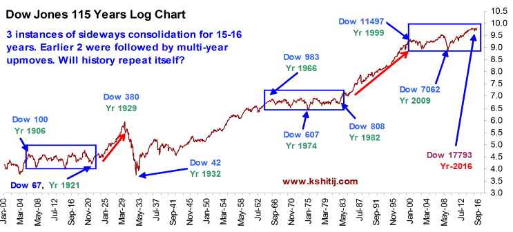
Dow Jones 115 Years Log Chart

The first consolidation (Jan 1906 – Aug 1921) took 188 months and the second consolidation took 199 months. The current phase that started from Dec 1999 will be 199 months old in June 2016. Allowing for some margin of error, July-August 2016 could be the starting of the next epochal, multi-year bull run.

As mentioned, this might sound improbable to most people given the current preoccupation with low global growth, QE and negative interest rates. Similar despondency might have ruled the popular spirit in the 1920s and in the 1980s (please see the last page of this report). Yet, from the darkest moments have emerged the most brilliant bull markets, as seen above.

Years of prior hard work in solar energy, in electric cars, robotics, genetics, e-commerce and many other fields could be coming to fruition in the coming years. If the Dow were to indeed move up as suggested by the chart above, it could target about 12.00-12.50 on the Log scale. That would translate to a nominal value of 162,750 on the DJIA, compared to the current level 17977, or returns of 9X in the next 10-15 years. For now, we can well target 22500 over the next 12 months.

We are approaching the end of April. People might be preparing to “Sell in May and go away”. That could well lead to a very near term dip. But, we would suggest that people should come back by June-July and start looking around for buying opportunities to participate in what might be the biggest bull market in our life times.

Looking at the above chart, the question to ask is, “Is this the best time to go Short on Human Ingenuity, or would it be better to go Long?” We would like to approach the market from the Long side. The following pages show a few more technical studies to back up our bullishness.

Inflation adjusted price comparison

The inflation adjusted price (“Real”) of the S&P 500 opens up the hidden strength or weakness, not obvious from the normal price, both of which are shown on a Log scale in the chart below.  
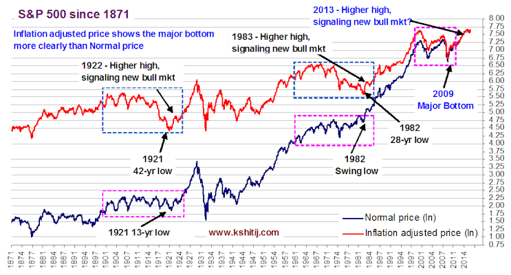
S&P 500 since 1871
When the Nominal S&P hit a 13 year low in 1921, it was well within the 15-year old (1906-1921) sideways range boundaries but the Real S&P shows it to be a 42-year low, markedly different from the previous lows and a prime candidate for a major bottom. In 1982, the low registered by Nominal S&P was actually closer to the upper end of the 16-year old (1966-1982) sideways range (marked by pink rectangle) but once again, the Real S&P shows it to be the lowest point in 28 years.

Similarly, in 2009, the Nominal S&P hit a 12-year low, but it was a 14-year low for the Real S&P. This can be taken as a major bottom despite the period of 1999-2009 being much shorter compared to the earlier two instances. When seen through the lens of Inflation Adjusted Price, in all the three instances, a multi-decade low has been registered followed by a higher high giving the initial signal of the next bull market.

As the S&P now trades above the 2007 high, there is a possibility that the next major bull run has already started in 2009 and the next up leg can unfold in 2016.
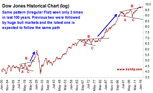
Dow Jones Historical Log Chart

Irregular Flat formations

In Elliott Waves, an Irregular Flat consists of a higher high (marked by red B) and a lower low (marked by red C).

Since 1900 there have been three significant instances of this pattern formation, shown in the chart alongside, all of which coincide with the sideways consolidations shown in the earlier page. The last two Irregular Flats (in the 1920s and 1970s) resulted in multi-year rallies and the current instance can also resolve on the upside.
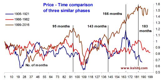
Price Time Comparison of three similar phases

Fractal Comparison

A time comparison of the three periods highlights a strong similarity till about the 143rd month at least. Thereafter, the paths diverge after about the 166th month (14th year).

The significant difference between the current period and the earlier two periods is that QE has enabled the DJIA to move up over the last three years. Perhaps QE has enabled some amount of wealth preservation, even if in the hands of a few? Could that provide the essential fuel for the next bull run, if those who have the wealth invest it in the commercialization of the emerging technologies.

Socio-economic events

Although we have no delusions about ourselves being historians or sociological experts, we have tried to paint below a broad picture of the things that were happening in the world in the consolidation periods seen in the charts earlier. Was there any commonality that gave rise to the bull markets that took shape afterwards?

Period-of-1906-1921

The period of 1906-1921 was a period of political upheavals and technological progress. China saw the end of monarchy and its first republic. Russia too saw a similar end of monarchy with the Bolshevik revolution led by Lenin. World War I came with devastating results for Europe, setting up the foundations for the next world war.

In the USA, the Ford Model-T car and the Texas oil boom revolutionized transportation, and assembly-line based mass production revolutionized industry. The country also benefited from its mercantilist policies in the initial part of WW-I and later from the war reparations from Germany, the leader of the Central Powers countries that were defeated in the world war. The ground was ripe for a bull run to take place.

Period-of-1966-82

The period of 1966-82 was an age of global anti-establishment and free thinking. Wars, strife and technological progress again ran parallel to each other. Universities across USA erupted in anti-war protests against Nixon’s ill-fated Vietnam War. It was a time of hippies and flower-power, free-thinking and drugs and, of course, the gloriously anti-establishment rock music. While the two global superpowers USA and Russia were engaged in a cold war, Deng Xiaoping became Chairman in China and paved the way for the economic progress that was to come in the next decade. The Middle-East saw the Iranian revolution and Saudi Arabia engineered the first oil price shock.

One of the most significant events economically was the abandonment of the Dollar-Gold peg, giving rise to the creation of fiat currencies and the free float currency markets. The cold-war fuelled a lot of technological research and progress sponsored by the Pentagon-CIA. All these together gave rise to the bull run that followed.

Interestingly, the seeds of future revolutions like the internet, genetics and robotics were all sown at that time.

The-current-period-of-1999-2016

The current period 1999-2016 has also seen global strife (Jihadist terrorism and America’s disastrous engagements in the Gulf and Afghanistan) alongside tremendous technological progress.

Despite periodic upheavals, Europe has come closer internally after the introduction of the Euro in 1998. China has emerged as a new economic superpower. The global economic paradigm has changed after great financial meltdown of 2008 forcing global central banks to try to prevent prolonged recessions with unabashed Keynesian policies. This period has also seen the coming of age of the Internet, of e-commerce, solar energy and medical breakthroughs such as the taming of cancer. And the world is now agog with the promise of new revolutions such as electrical cars, robotics, 3D-printing and blockchain powered bitcoin money.

Each of the three periods above can be seen as fertile ages for human innovation that eventually expressed as large bull markets. We repeat, the question to ask is, “Is this the best time to go Short on Human Ingenuity, or would it be better to go Long?”

Brent Rupee Corelation

Study on Counter-intuitive Correlation between Brent & Rupee

02-May-16 / Brent 45.91 / USDINR 66.44

EXECUTIVE SUMMARY:

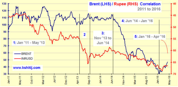
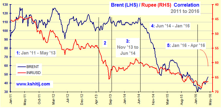
Contrary to the popular notion, data shows that Rupee & Brent Crude move mostly in a similar direction and not opposite to each other. This means, a fall in Brent does not lead to Rupee appreciation. Rather, the Rupee tends to gain when the Brent rises. The logic is probably that a rise in Brent is symptomatic of an increase in economic activity, which fuels growth and leads to a rise in Equity markets. That, in turn, attracts FII investments, leading to Rupee strength in the process.

This study highlights the counter-intuitive but highly correlated movement of Brent and the Rupee.

Note: In all the charts, Dollar-Rupee is shown in an inverse scale, on the right hand side of the chart.

The first chart shows the period from 2011 till date. As can be seen, there is a broad positive correlation between the fall in Brent over the years and the weakness in the Rupee over this period. The rest of the charts that follow show the numbered periods in greater detail, except for the period 2, when Brent and Rupee moved in opposite directions.

Brent Rupee Corelation


16 Month Preview

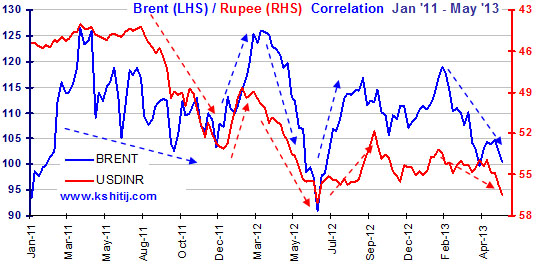
1: Jan ’11–May ’13 

In this 16-month period, multiple instances of movement in the same direction are seen (marked by arrows).

Major tops and bottoms also took place almost at the same time.

2. Nov ’13–Jun ’14

Brent soared by 6.98% & Rupee gained 2.68%.

Brent Rupee Nov13-Jun14


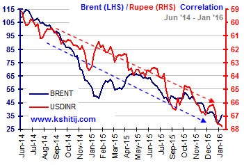
3. Jun ’14–Jan ’16

Brent lost a massive 65.58% and Rupee lost 15.83%.

Brent Rupee Jun14-Jan16

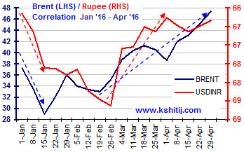
Brent Rupee Jan16-Apr-16

4. Jan ’16–Apr ’16

Initially, Brent and Rupee weakened along with each other. Later, from February, Brent gained from 33 to 47, while the Rupee gained from 68.75 to 66.00.

The directional synchronicity of the last few months is clearly visible on this chart also. The bottom in Brent has been reflected in gains in the Rupee also as once again the movements of Rupee and Brent have been in the same direction.


CONCLUSION:

Over the last few years, global investment sentiment has tended to oscillate quite often with the price of Brent. An appreciation in the price of Brent triggers a risk-on approach, flooding all emerging markets including India with liquidity, making the Rupee strong against the Dollar.

This kind of uncommon counter-intuitive studies and insights are what make our analysis and forecasts a little more worthy of our discerning Clients.

Kshitij 21 Years of Reliability

Stop Press! Or, why KSHITIJ.COM is reliable

Kshitij 21 Years of ReliabilityMerriam Webster defines “Quality assurance” as “a program for the systematic monitoring and evaluation of the various aspects of a project, service or facility to ensure that standards of quality are met.”

Over the years, Kshitij.com has been constantly refining its forecasting processes and this has resulted in the reliability of our forecasts increasing from 40% in 2008 to 72% in 2016.

For, at Kshitij.com, we have a very simple understanding of quality. We can know that a bakery is good when the baker serves his own cake at his daughter’s birthday. A barber should be ready to cut the hair of his own son and a tailor’s son should be ready to wear the trouser his father stitches. In simple terms, we have to be ready to use our own analysis and forecasts. And, we ourselves are not all easy to satisfy.

Every step of a report is checked and rechecked multiple times before it can be published but sometimes, even that is not enough for us.  Something like this happened recently.


STOP PRESS

A few weeks back we were on the verge of publishing our January 2017 Quarterly Dollar-Rupee forecast. The report was ready to be sent to our Clients. But, something was troubling us. Just when we were going to press the “Send” button on the mail that was to go the clients, we held back for a final check. It was a classic Stop Press moment.

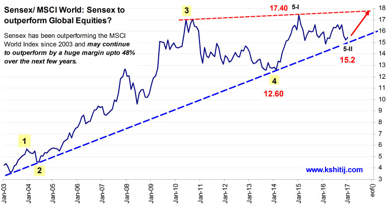
The report had a Sensex/MSCI World Equity Index ratio chart in it (see Chart A below).  The chart was bullish, using both classical charting (trend lines) and Elliot Waves. The implication was that Sensex could outperform the MSCI World Equity Index by a monstrous 48% over the next few years. We were excited about sharing this bullish implication with our Clients.

Chart A: Since 2003
Sensex to outperform Global Equities

Elliot Wave projection details:

Assuming 5-iii to be at least 138.2% of 5-I gives us 21.83 as the 5-iii top, much above the red trendline, which provides the first resistance/ target near 17.80. If 5-iv retraces 38.2% of 5-iii, then 5-iv may end at 17.73 and a final 5-v may make a top at 22.53, assuming equality between 5-I and 5-v. A rise to 22.53 from 15.2 translates to a huge appreciation of 48.22% over the next few years.

Still, we felt a bit uncomfortable with the chart since we did not know the historical context of the chart before Jan 2003. We wanted to see the price chart prior to 2003 as well just so that we knew what had happened earlier.


LOOKING FOR LONGER HISTORY

While we had a long history of Sensex in our proprietary database, we did not have a correspondingly long history of the MSCI World Index data.  It was going to be hard work searching for historical data. But the team was feeling dissatisfied with the chart and so it went ahead and searched for the data.

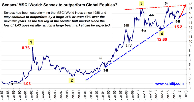
The search yielded the desired data for MSCI World (from 1987) which expanded the time horizon by 16 years going back to 1987 and when plotted on the chart, brought forth new perspectives. The trend structure was more clearly understood now and fresh insight was available.

Chart B: Since 1987
Sensex to outperform Global Equities in a larger time frame

Elliot Wave projection details:

Assuming equality of the large 5th wave to the 1st wave (from 1.03 to 8.76) gives us 20.33 as the initial target, about 34% higher from the low of 15.2. Interestingly, equality of 5-iii to 5-i gives us 20, coinciding with the target of 20.33 seen earlier. This is just a little less than the 22.53 target calculated on the first chart.

This new, longer period chart was also bullish using both classical charting (trendlines) and Elliot Waves. The highly bullish implication didn’t change but the perspective definitely changed a lot.

DIFFERENCE MADE BY THE LONGER TERM CHART

1)      We got a major confluence target of 20.33 (appreciation of 34%)

2)      If the large 5th wave takes an equal amount of time to the large 1st wave, then this target of 20.33 can be met in the next 2 years.

After the targets of 20.33-22.53 are met, we can expect a major bear market to unfold in the coming years, which would imply that the Sensex may underperform the World market for a decade, after the current upmove ends in a few years.

WHY WE DID ALL THIS

Looking at the final result, anyone might say that we could have very well used the old chart, since there was no change in the overall bullish outlook. One may ask if there was any point in the entire exercise of gathering extra data, modifying the chart, and finally even writing about it.

We used the new chart because a longer timeframe always gives a better perspective and gives a better understanding of where we are standing with respect to the historical context. The biggest perspective change we got is clarity that although the Sensex/ MSCI Ratio is in an uptrend for the next few years, this rally may well be the last major upleg of the uptrend that started in 1987-1990.

BECAUSE RELIABLITY MATTERS TO YOU

And what is the purpose of our writing about this entire process? As a Reader, you come to us looking for reliable forecasts. Here we have shared with you our thought process and the care we take before publishing any of our reports. The practical example in this article will help you know why our reports and forecasts are “Reliable”.


PS:
We are the only currency forecasting service in India to publish a track record of the Reliability of its Dollar-Rupee forecasts for the last 11 years (since 2006). Our Reliability has increased from 40% in 2008 to 72% in 2016.

If you need Reliable Dollar-Rupee forecasts, or forecasts on any other markets, write to us as info@kshitij.com

USDINR View Mar'16

Have you got the Kshitij.com Advantage?

Highlights of Kshitij Forecasts: 2016

Kshitij has been making long term forecast for almost the last 16 years to help you meet with the oppurtunities that the market inevitably brings.

Ranked #1 worldwide by Bloomberg We were ranked #1 worldwide, by Bloomberg for our Dollar-Rupee forecast in Dec’15.

And to prove that it wasn’t a one off we continued to deliver startling forecasts even in 2016. Here are some examples of forecasts that were outside the consensus when they were made, but were proved correct.

Note: We are the only non-bank forex forecaster in India to have earned this #1 ranking from Bloomberg.


Here are some examples of forecasts that were outside the consensus when they were made, but were proved correct.

2016 Recap: USDINR

What we said :

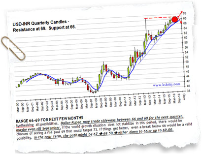
In our Mar’16 monthly report, we had said that USDINR (67.34) may trade sideways between 66-69 till Sep’16.

USDINR View Mar'16

What happened :

USDINR remained stuck exactly between 66 and 69 till the very end of 2016.

USDINR Quarterly Candles

Download Longterm Forecast Report

2016 Recap: Nifty View

What we said :

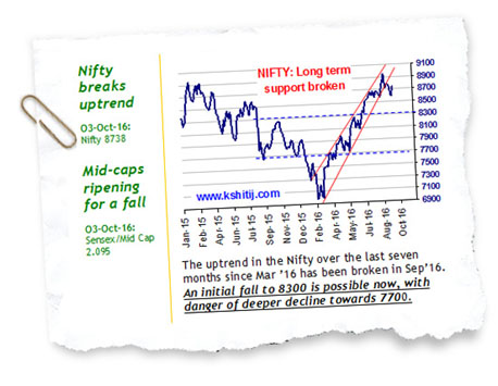
In our Oct’16 quarterly report, we had said that the Nifty could test 8000 and even 7700. (Most people were bullish at that time)

Nifty View Oct'16

What happened :

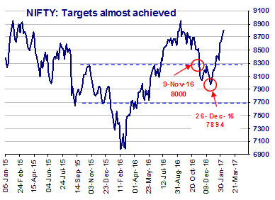
Nifty tested 8000 on 9th Nov’16 and further made a low of 7894 on 26th Dec’16.

Nifty View Nov'16

2016 Recap: Brent View

What we said :

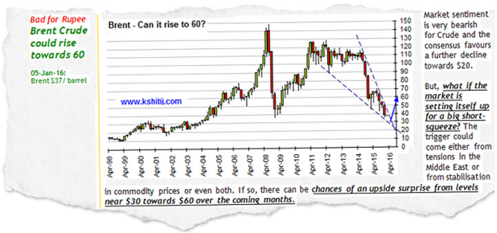
In our Jan’16 quarterly report, it was said that a big short squeeze might push Brent ($37) to $60 levels.

Brent view Jan'16
What happened :

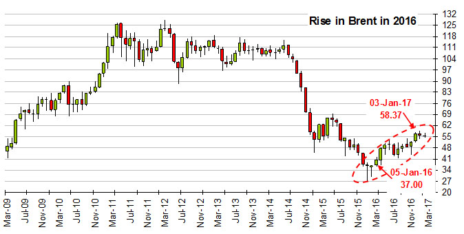
Brent has risen to make a high of $58.37 on 3rd Jan‘17.

Rise in Brent

2016 Recap: DOW View

What we said :

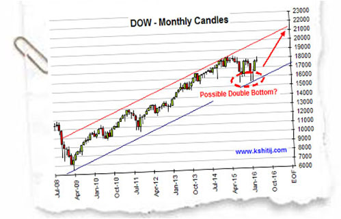
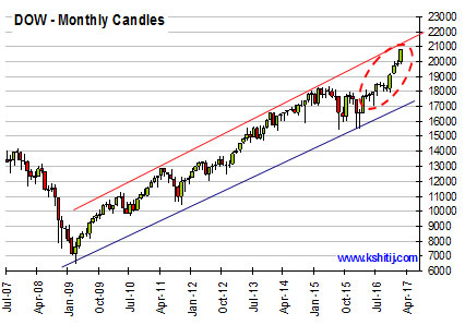
In our Apr’16 article “Can Dow Jones rise 9X times?“, we had said that Dow Jones (17990) might rise to 22500 in the next 12 months.

Dow view Apr'16

What happened :

Dow has tested 21170 on 3rd Mar’17 with the possibility of further rise to 22500 by the end of Apr’17 open yet.

Dow view Mar'17

72 percent reliability And many other such examples makes us the only forecaster with
a 11-year track record of 72% reliability for our Dollar-Rupee forecasts.

To see how we calculate Reliability and to see our 11-year track record, please click on http://72pct.com

Can you afford forex hedging without the KSHITIJ.COM advantage?

  • Our long-term forecasts can help you not only in Forex hedging but even in business planning.
  • Our personalised forex hedging advise not only helps you save costs, but also reduces your forex headache.

Download Longterm Forecast Report