Author Archives: Vikram Murarka

About Vikram Murarka

Chief Currency Strategist at KSHITIJ.COM. Likes to look at the markets from many different angles. Weaves many conventional and unconventional technical analysis techniques and fundamental analysis into a global macro perspective. Likes to take the road less traveled.

Sensex and GDP Growth

Born Again Sensex Bulls

Sensex Normal Chart from1979 to 2006

Sensex: 9311.19

Happy New Year !

Gentle Reader, this issue comes out after a considerable gap (so what’s new?) and you could say we’ve been lazy. We would say we’ve been busy making money for Clients, but still, this issue of “The Colour of Money” has been long pending. Thank you for bearing with us. We start with something new this year by looking at the Indian equity market, reserving a case study in Foreign Exchange trading for the next issue. Happy Reading!

Born Again Sensex Bulls

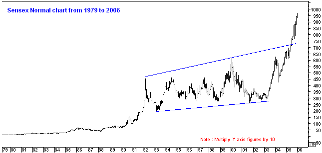
The Sensex has risen 233% in less than 3 years (from near 2908 in Apr-03 to 9689 in Jan-06), yielding an average return of 77% per annum. Many people on the Street are fearful and some are more or less convinced that this exponential rise may be a bubble, waiting to burst.

Perhaps not. Vertigo is understandable if you use a zoom lense and look at the steep rise in last 3 years. However, we used a very wide angle lense to look at the Sensex over a span of 27 years since its inception and think there is room for “born again Sensex Bulls”. The basis for our bullishness is that the Sensex has started moving up after a 10-year consolidation, that it represents a wider cross section of the economy than before and that the economy itself has moved onto a higher growth path.

Decade Long Consolidation


After its inception at 100 in 1979 the Sensex “apparently” moved sideways till the mid-80s (more on that a little lower down). It gained speed and started moving up rapidly from 1987-88 and reached a zenith near 4550, culminating with the Harshad Mehta scam in April 1992. Thereafter, the Sensex went into a decade long consolidation between 2100 (1993 bottom) and 6150 (2000 top). It has now exploded out of the channel, suggesting that there may be a multi year Bull Run in the offing.

In fact, the Sensex again offers the same opportunities for creating tremendous wealth like it provided in the period from 1979 to 1992. This fact is not captured in the normal monthly chart as seen above. For that, we look at the Log Chart (below), which tracks percentage price movements as opposed to a normal chart, which tracks absolute price movements. For example a move from 100 to 200 to 300 will be shown as 100 point move each time in a Normal chart. A Log chart, on the other hand, will show the move from 100 to 200 as a 100% move and from 200 to 300 as a 50% move.

Sensex Log chart since 1979 to 2006

From 1979 till 1992, the market was in a very big bull run producing a stupendous return of 3581%. Subsequently, in the next decade the market consolidated within an upward slanting channel (AA and BB) as Corporate India came to terms with the realities of reforms, deregulation and liberalization and companies worked frantically to restructure themselves. The period was also marked by several government changes and the emergence of coalition governments as a new political reality for India. The corporate sector lived through all this and became leaner, meaner and ready to take on the world.

Slowly the world realized that India meant business. As global capital embarked on a diversification drive in the aftermath of 9/11 (a process that may continue for several more years), India rode the wave of a new Emerging Markets euphoria. In June 2005 the Sensex broke through the upper end of its decade long run of “merely adequate” returns.

It now seems that the decade long consolidation may be over and the Sensex may soar once again for several years like it did in the period from 1979 to 1992. Compared with the 3581% rise at that time, the Sensex has risen “only” 300% so far from the April 2003. There would still be a lot of room on the upside, if history is to repeat itself, and the current bull run may, in fact, be in its infancy.

NEW and IMPROVED

The Indian economy has changed in the last 10 years while the Sensex was slumbering like Rip Van Winkle. Reflecting the changed structure of the Indian economy, the composition of the Sensex has also changed.

Changed structure of the Indian economy

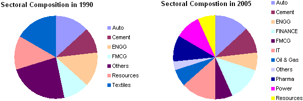
In 1990 the index was limited in its composition and had only a few sectors participating in it. The Index composition is much more diverse today incorporating almost all the sectors of the economy apart from agriculture. Notable additions are IT and Oil & Gas while Textiles is the notable deletion. It’s a whole new improved Sensex that we are buying today.

Sensex and GDP
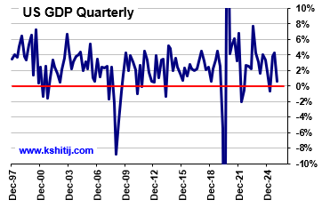
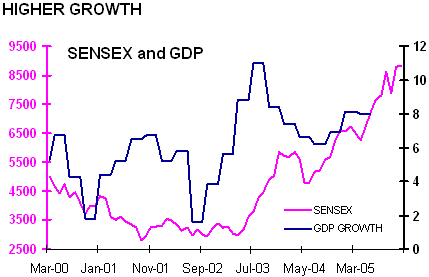
Lastly, there has been a sharp increase in GDP growth after Sep-02. The economy has moved into a new, higher growth zone altogether, as can be seen in the chart alongside. The Sensex also has moved up sharply in the same period, reflecting the new found growth.

Looking at the Sensex from three different perspectives, viz. its percentage movement (the Log chart), its composition change (the Pie chart) and its rooting in strong GDP growth (the Line chart) we would tend to believe that a structural bull run similar to that of the 80’s may have just started.

USD-JPY Weekly

Trading Lessons 1 – When best becomes worst

Gentle Reader, 
It is with great pleasure that we bring you this issue of “The Colour of Money”. Here we recount two dramatic trading experiences, which gave rise to some enduring lessons, which are of relevance today and tomorrow, for Corporate Hedgers and Traders alike. Enjoy!

Good experience turns bad 
Have you ever felt like a King in the forex market? How does it feel to wipe out 6 months’ of losses in a matter of 2-3 weeks? It feels really good. But then, how would it be if such a sublime trading experience morphs into one of your worst trading experiences?

This happened to me in 1998 and thereafter. I had been bullish on Dollar-Yen since 1995 (see http://www.kshitij.com/risk/casestudy2.shtml,  http://www.kshitij.com/research/majors2.shtml,  http://www.kshitij.com/research/jpyloan1.shtml) when the market was near 100. I had been targeting 120 initially and then by 1997, I was looking for 140. Then, by mid-1998, the charts looked like they were peakingand fundamental factors also started suggesting that the market could be running out of oxygen. I had closed out my Longs and had started becoming bearish.

On the other hand, the GBP-USD market had been trading flat in the first half of 1998, whipsawing between 1.61 and 1.70. I was getting stopped consistently out of my Cable positions, accumulating huge losses in the process.

And then, the Dollar-Yen market broke in August 1998. The trigger was the Russian debt default and talk of interest rates rising in Japan. A lot of “carry trades”, which had been in put in place since 1995, started being unwound and the LTCM debacle only added to the mess. Dollar-Yen crashed from 147.62 in mid-Aug-98, to a low of 111.73 by 09-Oct-98. The largest and sharpest fall was from 135.50 on 02-Oct-98 to 111.73 on 09-Oct-98.

I had been waiting for this and I shorted Dollar-Yen heavily, adding to my position along the way. I was able to capture a good part of the fall, as shown by the Blue segments in the chart below. My trades during this memorable period were:

Usd-jpy weekly Profit and loss table

 I made a killing. All the losses incurred on Cable trading in the last 6-7 months were wiped out and I had a very handsome surplus to boot.

The purpose of recounting this story to you is twofold. Firstly, to touch upon a psychological aspect of this trade. Although I had started shorting Dollar-Yen at the right time and the market was going my way, trades were hesitant in the beginning. Then (and this is what is important) I thought, “This is a very good opportunity to wipe out your earlier losses. Have some courage and increase your position!” I did, and it worked. The courage paid off. It is something to remember and to trade by.

Warped view
The second reason for narrating this incident, and the more important one, is that this episode gave me a warped view of the market. I had made 9.86% in a few weeks, and I thought it could be done again, and again. I started looking for sixers/ home runs on every ball (trade). Adding to the headiness of this experience was the second part of the old market adage (which is never properly explained/ understood), “Cut your losses; Let your profits run”. I was quick to cut my losses, no doubt. And I was also letting my profits run. But, somehow I was just not making money! In fact, I started running up losses again. My sublime experience had become a nightmare.

The problem was, I did not realize that the huge fall in Dollar-Yen in 1998 had been a once-in-a-lifetime episode. The currency markets, unlike the equity markets, do not (usually) produce large, long lasting trend movements (in fact, it would seem that central banks at the G7 have been working in co-ordination since 1998 to reduce forex volatility). As such, in day-to-day trading, there was a need for me to take many more quick singles and twos, instead of looking for a sixer on every ball. An occasional four was welcome, but that too might not happen to often.

EURUSD….Freq of Pips P/L per TradeLooking for answers
I then started keeping a track of each trade and made a histogram of the profit/ loss per trade over a period of time, as shown alongside.

It showed me three very important things. The first, of course, was that “made a killing” trades happen only occasionally. Secondly, the few times I did not cut my losses quickly were responsible for most, if not all, the losses in any given period. Thirdly, I needed to somehow offset the many small losses that were a legitimate part of day-to-day trading.

Usdjpy daily amplitudeThis led me to the study of Currency Amplitudes. How much does a currency normally move in a given time frame? A study of the chart alongside shows, for example, Dollar-Yen has an average Daily amplitude of 1.26 (amplitude on the X-axis, frequency on the Y-axis). Further, there’s a 68.5% chance of it moving 50-150 pips in a day, but only a 12.3% chance of it moving more than 200 pips.

Obviously, 300-400 pips profits were not going to happen every day! For short-term trading, it was better to capture 60-80 pips profits. If I did that often enough, and limited the losses to 40-50 pips, I stood a good chance of making profits.

I incorporated these new insights into my trading method and my losses diminished and profits started picking up. This is how a good experience turned bad but forced me into deeper study, which, eventually making me a better trader.

For more research on Currency Amplitudes, you can access http://www.kshitij.com/research/ampl.shtml

Dollar-Yen Chart

Trading Lessons 2 – Trading ranges without stops

Here is another trading story, again with Dollar-Yen as the background. Many Traders, especially in the early years, do not realize that there are two kinds of market – a sideways ranging market and a trending market. And unfortunately, there are often two kinds of Traders – range traders and trend traders.

Dollar Yen ChartThis story unfolds in the first half of 1999. The Dollar-Yen market had stabilized after the fall of 1998. It had been trading sideways in a 7-big figure range between 117-124 from Feb-99.

Range Traders were busy making money hand over fist, buying low and selling high. The secret of their success was that few worked with Stops, because Stops have a habit of getting triggered in a ranging market.

But then, the unexpected (though inevitable) happened. Dollar-Yen crashed in July-99 to hit 115. A lot of the Range Traders were caught Long and wrong. Moreover, they did not have Stops in place. Worse, the market paused a bit after hitting 115. Many Traders thought the market was going to rebound and doubled/ tripled their Long positions, again without Stops.
Oh misery! The market resumed its fall, refusing to stop till it hit 105. It was later heard that one particular trader, who had been the toast of the market when it had been trading between 117-124, had been eased out his job and had quietly left the country.

Moral of the Story:
Work with Stops, always. Your stops may be wide; they may even sometimes be mental. But, be disciplined and implement your Stops when the Stop Loss levels are triggered. Otherwise you are committing trading hara-kiri.

US 10-Year Yield and Fed Funds - Inversion not necessary for Recession

An Inverted Yield Curve does not necessarily imply recession

Conventional market wisdom tells us that Yield Inversion usually leads to a recession. Yield inversion happens when long-term yields trade below short term yields. Most of the time, the focus of the inference is usually on the US economy. There has been a lot of debate on the subject. We did not know about the existence of a debate till now, when we did a quick internet search on the subject. Some experts, notably the Fed, say that an inverted yield curve does not imply recession. Some others aver that it does.

Our own independent study was born of the observation that the Dow Jones Industrial Average (DJIA) has been going up through 2006 even though the Yield Curve has been inverted. We wondered how this was so, when common wisdom suggested otherwise. We took data from the Fed websites and looked at the performance of the DJIA during periods of yield inversion, to see if the Dow fell during such periods. We have used the difference between the US 10-Year T-Bond yield and the Fed Funds rate to measure the Yield Inversion. A negative (when the 10-Yr yield is less than the Fed Rate) value means the Yield Curve is negatively sloped, or inverted. The results can be seen below.

US 10-Year Yield and Fed Funds - Inversion not necessary for Recession

The periods of yield inversion are circled in red. There have been six major instances of yield inversion since 1972. The DJIA has fallen during three of these and gone up during the other three. Notice that the period from 1962 to 1981 saw a secular rise in interest rates. Since then, however, interest rates have been in a secular decline. The first two periods of yield inversion occurred between 1972-81, when interest rates were on the rise. They were both relatively prolonged and both were accompanied by a fall in the Dow. In fact the Dow fell some 34% in the very first instance. It fell around 6% in the second episode of yield inversion.

Thereafter, since interest rates started falling from 1981, the Dow has fallen in only 1 out of four periods of yield inversion, and that too only 9%. Further, note that the periods of yield inversion have been relatively short, never more than a year in duration.

Based on the above empirical evidence, it cannot be inferred that yield inversion leads to recession. If anything, we may venture to say that recessions are more likely during periods of prolonged rate increases and less likely during periods of prolonged rate decreases. Or in other words, it is interest rate increases/ decreases that matter more than the shape of the yield curve.

Risk/ Reward – Enhanced!

Of TPs and SLs
Most Traders will agree that 60% of the times they miss their Take Profit (Limit) orders by 2-5 pips, or miss a dream Entry Order by 2-5 pips. And frustratingly, 60% of the times their Stop Loss Order gets triggered just 2-5 pips inside the top/ bottom of the market. Is this not true?

Why should this be so? Is a strange diabolical phenomenon perpetually working against the Tribe of Traders? No. Looking at things dispassionately, it is clear that we tend to place our TP (Limit) at levels that are 60% more difficult to reach, while our SLs are 60% easier to reach.

The phenomenon that is working against us is our own Greed (which makes us place the TP that extra 5 pips wider, to earn more) and our Fear (which makes us place the SL that extra 5 pips narrower, in order to keep losses at a minimum). The old adage of “Cut your losses short and let your profits run” also has a hand in most Traders wanting to keep relatively wider TPs and relatively narrower SLs. But unfortunately, we find the SLs getting triggered while the TPs are missed. All that might be needed, therefore, might be to make the TP narrower by 10 pips and the SL wider by 10 pips.

Risk/ Reward Ratio

But wouldn’t keeping a narrower TP and a wider SL make the Risk/ Reward Ratio go out of whack?

For the uninitiated, the Risk/ Reward Ratio is one of the oldest tools of Risk Management and Loss Containment. It says that, as a rule, for any given trade, the ratio of Risk (Loss) to Reward (Profit) should be less than 1, or in other words, the Risk should be less than the Reward. Obviously. Otherwise why would one trade? Or, at the least, the Ratio should be 1 (Risk = Reward). It should never be greater than 1.

How does one get an RR less than or equal to 1? Simply by choosing Profit and Loss targets appropriately. For instance, a Trader may keep her Profit target at 50 pips and the Loss target also at 50 pips, to arrive at an RR of 1. Another, more conservative Trader may place a TP 75 pips away from Entry and keep the SL 50 pips away, thereby ensuring that the RR is less than 1 (50/75).

In this way, both of them reassure themselves that they are responsible and disciplined Traders. The RR Ratio is, in fact, a good tool and does prevent a lot of loss. But, as we’ve seen before, our greed/ fear ratio (another word for conservatism) makes us lose money 60% of the times, because simply placing the SL/ TP at favourable levels for a good RR Ratio does not ensure that the SL will not be triggered and the TP will be triggered. Thus, the need for narrower TPs and wider SLs.

But, coming back to the question, wouldn’t keeping a narrower TP and a wider SL make the Risk/ Reward Ratio go out of whack? Suppose a Trader who usually works for a 50 pip profit and a 50 pip loss (RR = 1), now works for a 40 pip profit and a 60 pip loss, her new RR would be 60/40, greater than 1. How can that be acceptable?

Risk/ Reward Ratio Redux

All the RR calculations/ scenarios above are sans any Probability consideration. Or, at best, the implicit assumption is that the chances of both Profit and Loss are equal.

But, suppose placing the TP 10 pips narrower increases the chances of it getting executed, and a 10 pip wider SL reduces the chances of it getting triggered. Would that not be more desirable than equidistant TP/SL combinations or wide TP/ narrow SL combinations? Thus, we now take a fresh look at the Risk Reward Ratio. Welcome the RR with Probability.

Consider the following table:

  Base Case Fresh Case # 1 Fresh Case # 2
SL (pips) 50 60 65
TP (pips) 50 40 35
Probability of Loss or P(SL) 50% or 0.5 40% or 0.4 30% or 0.3
Probability of Profit or P(TP) 50% or 0.5 60% or 0.6 70% or 0.7
Risk/ Reward Ratio calculation SL/ TP SL x P(SL) / TP x P(TP) SL x P(SL) / TP x P(TP)
Risk/ Reward Ratio Result 50/ 50 = 1.0 60 x 0.4/ 40 x 0.6 = 24/24 = 1.0 65 x 0.3/ 35 x 0.7 = 19.5/25.5 < 1.0

In the Base Case, where the chances of profit and loss are assumed to be equal, the only way to achieve an RR of 1 is to keep the SL and TP equal distances. But, in the Fresh Case #1, the chances of Loss are seen to be lower than the chances of a Profit, precisely because the SL is wider than the TP. This suggests that a narrower TP and wider SL can also be acceptable if the probabilities are favourable.

You could stretch this a bit more (provided the probabilities continue to be favourable) to achieve an RR < 1, as seen in the Fresh Case #2. This is certainly more favourable than the earlier case.

But, can we keep stretching this by bits? A bit more, and then a bit more and so on? NO. It would not be possible, beyond a certain tipping point to keep narrowing the TP and widening the SL. Also, say you were working with a 1 pip TP having 90% chance of success and a 90 Pip SL having 10% chances, you would still get an RR of 1. BUT, the trade would NOT be advisable because even 1 such loss making trade would wipe you out.

Remember however, that this tool is to be used by Advanced Traders, who should be able to make reasonably accurate assessments of the Probability of the Risk and the Reward, apart from the usual considerations of trend determination etc.

Interesting? Roll the new RR around your tongue a few times to get the taste of it. Try it, use it. But do not overdose on it and try to work with a 1 pip profit and a 90 pip loss.

Featured Video Play Icon

Issues in Corporate Forex Risk Management

Risk ManagementNetting – An outdated concept?

A company has both Imports and Exports. Should it manage the FX Risk on both legs, i.e. on Gross basis? Or on the differential amount, i.e. on Net basis? Many companies seem to prefer the latter, managing FX Risk on a Net basis, seduced by the concept of “Natural Hedge”. 

We have an issue here. Our contention is that FX Risk should be managed on a Gross basis. Conceptually, it is agreed that the company has a natural hedge to the extent Imports and Exports cancel each other. But, on an operational level, do they really cancel each other out? There are bound to be Time and Amount mismatches. Reason enough for the Risk Manager to manage Imports and Exports separately, individually. 

Assume, for the sake of discussion, a scenario where there is no Time and Amount mismatch. Is it then acceptable to manage risk on a Net basis? To our mind, it is not. Here’s why.

Old Literature

The concept of Netting is based on old Risk Management literature, of the Eighties and Nineties, which pertained more to Banks than to Corporates. The market was different then. Europe still had several currencies, each with varying degrees of liquidity. Bid-Offer Spreads were high even in the most liquid currency pairs such as USD-DEM, ranging from 5 to 7 to 10 pips. Even 20 pips in times of volatility! It made sense then, to work on a Net basis, so as to minimize the confusion of so many currencies and to minimize the leakage due to high Bid-Offer Spreads. 

The business environment itself was a little easier than it was today, given the lower degree of globalisation at that time. Competition was less acute and margins from core business were higher. There was lesser need to extract juice from each and every business operation, especially from FX Management. 

Current Reality

The situation is different today. After the advent of the Euro in 1999, we now deal with fewer currencies. Market volumes have grown tremendously and market breadth has widened, bringing Bid-Offer Spreads down to a sliver. 

Business is itself tougher today. Competition is high both domestically and internationally. Core business margins have been driven down to wafer thin levels across most sectors globally, except, perhaps for the IT industry in India. 

Thus, while the need to avoid bid-offer spreads has decreased, the need to extract juice from each and every business operation has grown.

Need for Speed

Does any company buy its raw materials and sell its finished products at the same price? Obviously not. Every company tries to buy its raw materials at the lowest possible rates and sell its products at the highest possible rates. We need to look at currencies in the same manner as any other commodity or product. Profit maximization demands that Imports and Exports should not be netted off against each other. The effort has to be to cover Imports when the rates are low and to cover Exports when the rates are high – whether this happens in the span of a day, a week, a month or even an year. 

But, would that lead to too much risk? Not so. In fact, currencies are less volatile and thus less risky than some of the commodity markets that businesses are routinely exposed to.

Not as volatile as commodities

Metals, Oil etc display much higher volatility, simply because the markets are not as large as the currency market. Further these commodities are far less liquid. Also, most commodity markets are Futures driven, as opposed to the currency and interest rate markets, which are OTC driven. As such, settlements can be more tailormade in the currency markets. 

Companies routinely deal with price fluctuations ranging from 10-80% in their input raw materials, without batting an eyelid. Can they then not manage currencies, which are much less volatile, in a more proactive manner? 

Sound risk management practices would ensure that undue risks are not be taken. The currency market itself being less volatile would ensure that the business is not exposed to huge risks. Makes sense?